Introduction to Graphic Design: Choose Your Right Composition and Layout
As an integrated marketing agency, we understand the importance of graphics especially in social media and advertising. As experts in Facebook and Instagram management, we know that well-designed graphics can make your posts stand out and attract more attention. In this article, we will discuss four design strategies for composition and layout of graphics that can help you create more attractive and effective posts.

Rule of Thirds
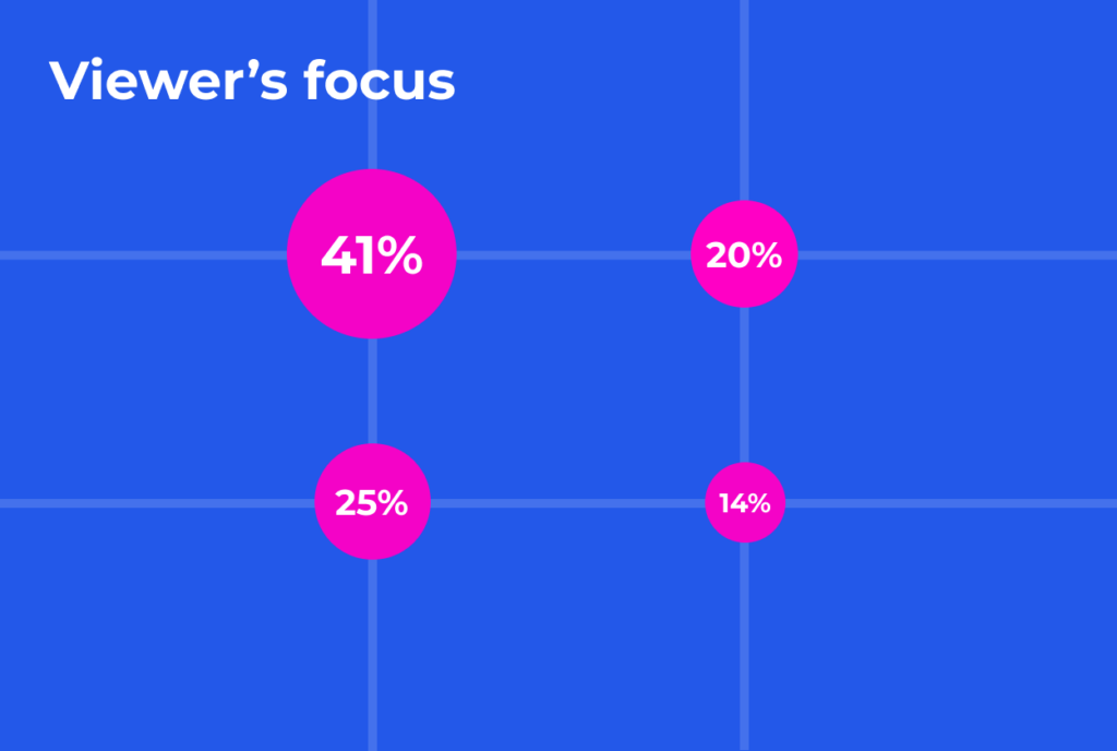
The Rule of Thirds is a composition technique that involves dividing an image into thirds both vertically and horizontally. This creates a grid of nine equal sections, and the points where the lines intersect are the key focal points of the image. By placing the most important elements of the image at these points, you can create a more balanced and visually appealing composition. The Rule of Thirds works best for images that have a clear subject, such as a person or object, and that need to convey a specific message or emotion.
Hierarchy
Hierarchy is a design principle that involves organizing elements of an image based on their importance. By using size, color, contrast, and other visual cues, you can create a clear visual hierarchy that guides the viewer’s attention through the image. This technique is especially useful for images that have multiple elements, such as infographics or product photos. By prioritizing the most important information and making it stand out, you can ensure that your message is clear and easy to understand.

Symmetry
Symmetry is a composition technique that involves creating a mirror image of an object or scene. This can create a sense of balance and harmony in the image, and can be especially effective for images that have a central subject, such as a building or a landscape. However, symmetry can also be used in more creative ways, such as by creating patterns or repeating shapes throughout the image.
Asymmetry
Asymmetry is the opposite of symmetry, and involves creating a sense of imbalance or tension in the image. This can be achieved through the use of odd numbers, diagonal lines, and other non-symmetrical elements. Asymmetry can be especially effective for images that need to convey a sense of energy or movement, such as sports or action photos.

Case Study: SFi Asian Family Impact Summit
In May 2023 Sustainable Finance Initiative hosted its inaugural Asian Family Impact Summit with the goal to convene Asia’s leading family offices and modern wealth owners in the impact space, to explore ways to accelerate the impact investing movement.
Voltage X took part in the event branding. The proposed design embraces the modern & traditional Asian wisdom of wealth management through a modernised symbol of a copper coin (銅錢). It also symbolizes Asian hand-in-hand (人) to bring impact together.
Final Thought
The composition and layout of graphics play a crucial role in the success of your social media and advertising campaigns. By using these four design strategies – Rule of Thirds, Hierarchy, Symmetry, and Asymmetry – you can create more attractive, effective, and engaging graphics that stand out from the competition. Look for an agency to help you create the perfect graphics for your next campaign? Contact us today to explore.
Social Media Image Sizes 2023: Instagram, Facebook, YouTube & LinkedIn
In today’s digital age, social media platforms such as Facebook, Instagram, YouTube, and Linke


